
A compact retail brief for Parkhurst
The client was a lifestyle retailer in Parkhurst, Johannesburg, looking for a small corner display that could carry the feel of a wider African craft range without taking over the floor. The store already had a strong interior mix of homeware, fashion and gifting, so the new section needed to sit naturally beside existing stock and still read as its own point of interest.
The brief was practical. They wanted a display that could be restocked easily, hold delicate pieces safely, and work for both weekday foot traffic and weekend browsing. The store also had limited backroom space, so packaging needed to be compact, labelled and simple to rotate. We kept the build honest and light, with enough texture to draw attention but not so much that it competed with the products.
- Retail type: independent lifestyle store
- Location: Parkhurst, Johannesburg
- Space used: one corner bay and one wall run
- Product mix: textiles, ceramics, baskets and small artisan goods
What the corner had to cope with
Parkhurst retail is busy in fits and starts, with sharp weekend peaks, school runs and casual drop-ins. The display had to be neat at 9am and still look decent after a full day of handling, especially where customers were touching folded cloth, lifting bowls and comparing finishes. Because the area gets strong light through the shop front, we also had to think about glare and dust.
A few practical limits shaped how this Parkhurst store corner was planned. The retailer needed something that could be set up fast, moved when promotions changed, and kept stable during load-shedding when the shop relied on smaller lighting pools rather than full brightness. We also had to account for fragile stock and local store rules around clear walkways, so the footprint stayed tight and the tallest item did not block sightlines. It sounds simple, but these things matter in a small shop floor.
- Footprint kept to a compact corner zone for easy circulation
- Display heights planned to preserve visibility across the shop
- Finishes chosen to reduce dust showing up too quickly
- Storage logic built in for quick top-ups between trading peaks
How we curated the merchandise mix
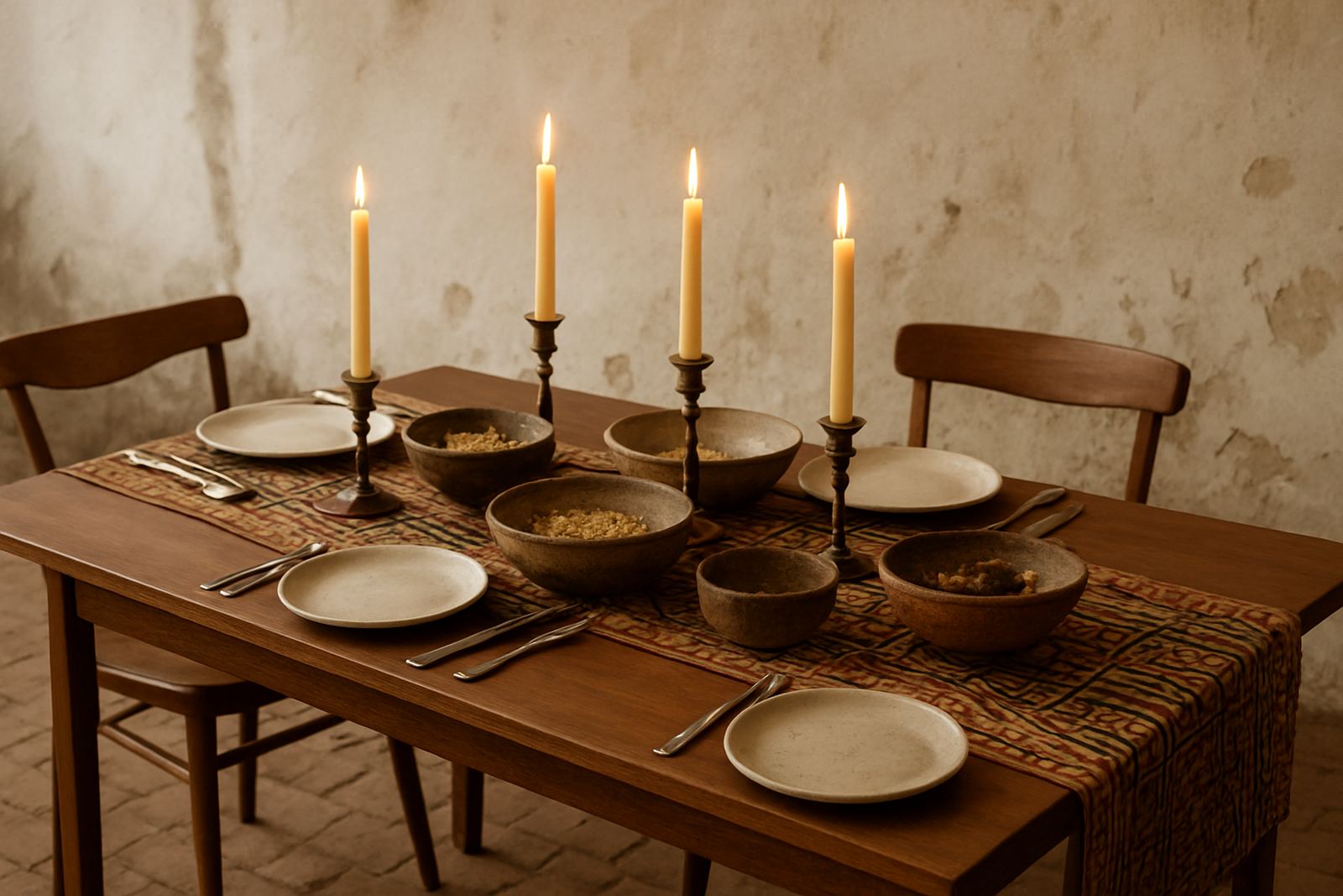
We supplied a focused mix rather than a full market-style spread. The idea was to show range, but keep the offer edited enough that customers could read it in one glance. Textiles carried the colour story, ceramics gave the table weight, and smaller artisan items filled the gaps for gifting and impulse purchase. Each item was selected with shelf life, handling and repacking in mind.
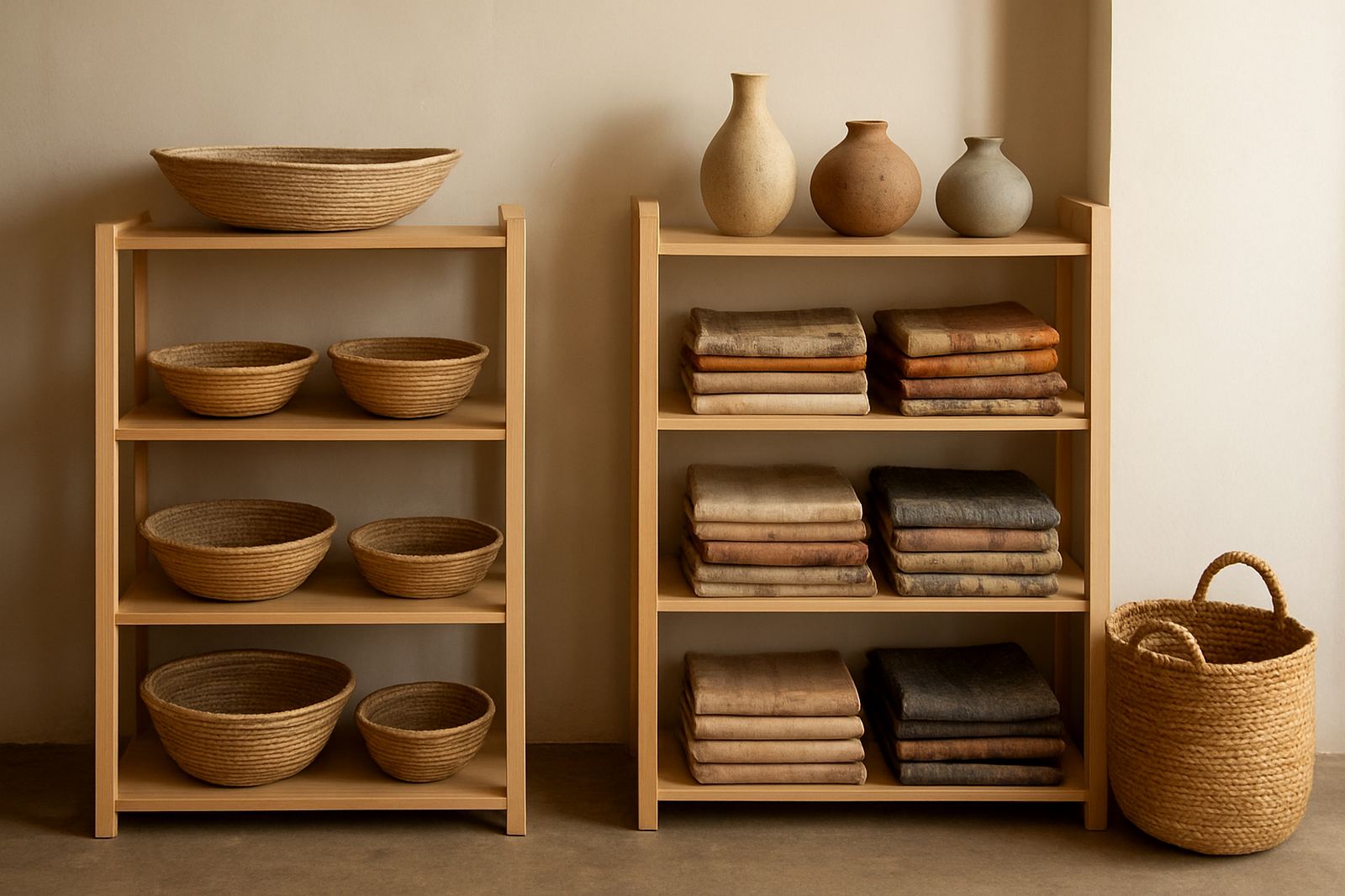
We worked with the retailer on a simple category structure. Folded textiles sat on the lower and middle levels, ceramics formed the central eye line, and the smallest goods were placed close to the till path for convenience. Provenance cards were included for key pieces so the staff could speak about maker location, material and process without needing to memorise every detail. That helped a lot on busy days when the shop floor was short staffed.
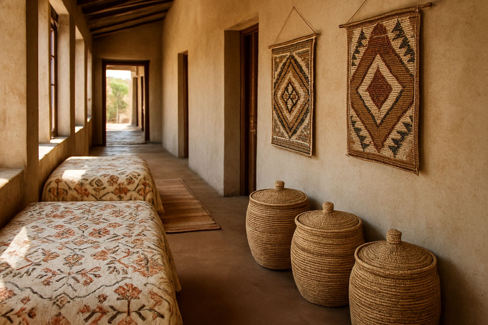
- Textiles: woven throws, table pieces and soft furnishings
- Ceramics: bowls, mugs, serving pieces and decorative forms
- Artisan goods: baskets, small home objects and gift items
- Support material: provenance cards and care notes
Display planning, packing and store fit
The main job was to make the corner feel curated instead of crowded. We planned the sequence of stock, packed it for a retail opening, and set out a simple merchandising order so the store team could maintain it on their own. The display used a mix of table height and vertical shelving, with enough breathing room between pieces to stop the corner from looking heavy.
Because ceramics and handmade goods need a bit of care, every item was packed with practical handling in mind. We used layered wrapping, clear outer labels and grouped cartons by category and season. That made receiving, counting and replenishing much easier. The retailer also wanted the corner to support gifting, so we added a small gift-ready zone that could be refreshed quickly during busy trade periods and holiday runs.
- Merchandising order supplied for staff handover
- Grouped cartons labelled by category and fragility
- Gift-ready section kept near the payment point
- Easy reset plan for weekly refills and seasonal changes
Timeline and delivery in four weeks
The project ran over four weeks from brief to install. Week one covered the intake meeting, floor measurements and selection of the product mix. Week two was for curation, stock confirmation and provenance prep. Week three dealt with packing, courier coordination and final display planning. In week four, the goods were delivered and the store team got a straightforward walk-through on how to keep the section tidy.
The schedule worked because it was realistic. There was no need to overcomplicate the process or hold back stock for too long. Everything arrived in one planned movement, which suited the retailer's floor plan and reduced the chance of stock damage. A clean setup also meant less disruption to trading, which is always important for a neighbourhood store that cant afford a long closure or a messy opening day.
- Week 1: brief, measurements and category plan
- Week 2: curation, stock confirmation and cards
- Week 3: packing, labels and courier planning
- Week 4: delivery, install and staff handover
What changed after launch
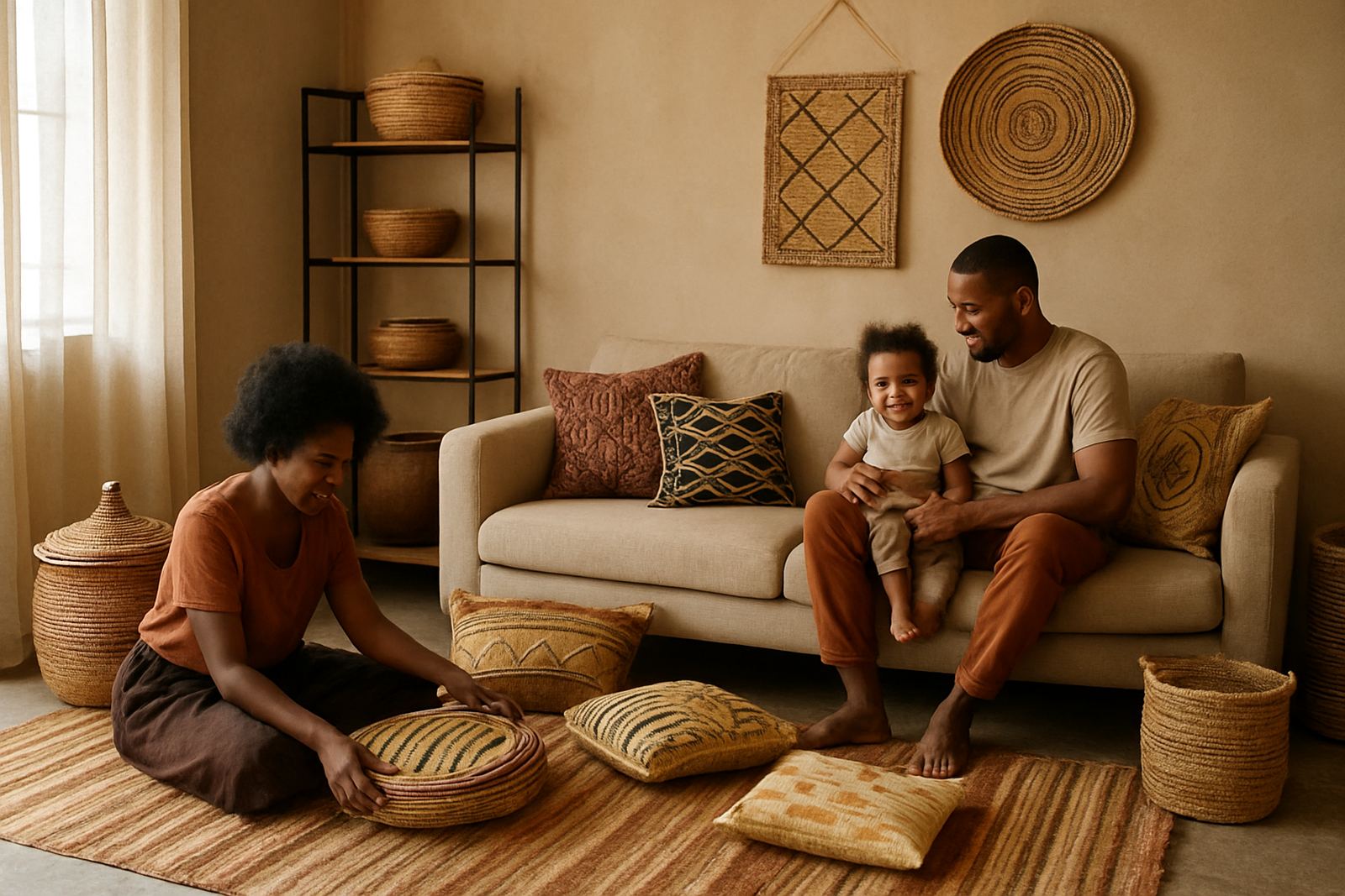
Once the corner was in place, the store had a clearer African craft offer that customers could read from the aisle. The mix of textiles and ceramics made the section feel balanced, while the smaller goods helped move interest into actual purchases. The retailer reported better engagement from shoppers who came in for gifts but ended up asking about material, origin and how the pieces were made.
From our side, the best result was that the display stayed manageable. It did not need constant rebuilding, and the store team could refresh it between trades without pulling other stock apart. We would do this kind of project again with the same approach: keep the range edited, build around the shop flow, and make sure the packaging and provenance systems are as practical as the display itself. That is what keeps a small corner useful, not just pretty.
- Clearer product story on the shop floor
- Better interaction around gifting and homeware
- Simple upkeep for staff during trading hours
- Stronger visibility for maker-led products
If we repeated the project
If we were doing another Parkhurst corner like this, we would keep the same formula and adjust the mix to the season. For winter we would add heavier textiles and deeper tones. For summer, lighter cloth and more open ceramic forms would suit the light better. We would also keep a little spare stock on hand for fast swaps, because retail in a small space changes quickly and you need flexibility.
For a compact shop floor, that balance matters. The retailer got a corner that felt considered, traded well and did not become a maintenance burden. It gave customers a focused view of African craft without crowding the rest of the store, and that was exactly the point.
Key facts
| Client type | Independent lifestyle retailer |
|---|---|
| Town | Parkhurst, Johannesburg |
| Project timeline | 4 weeks from brief to handover |
| Display footprint | 1 corner bay plus 1 wall run |
| Product categories | Textiles, ceramics, baskets and small artisan goods |
| Service scope | Artisan sourcing, custom curation, provenance cards, export-safe packing and courier coordination |