
Why a glazed bowl can do the job of three loud items
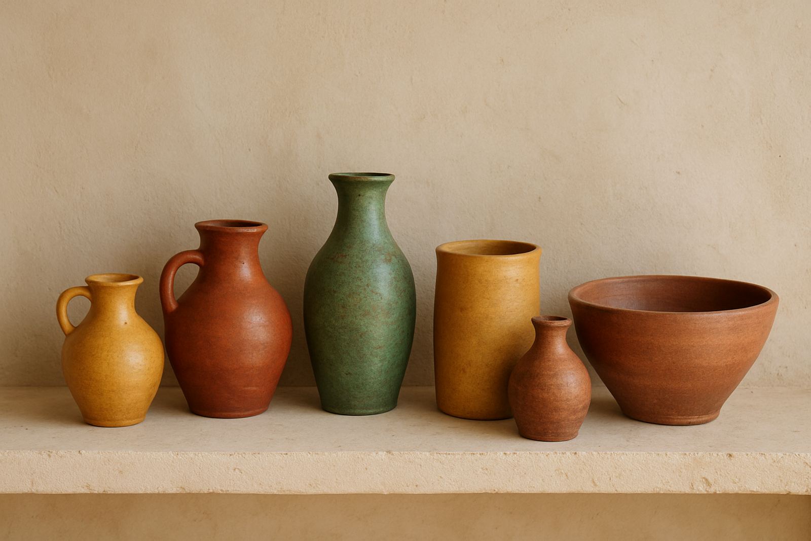
If a lounge already has a plain sofa, a timber table and neutral curtains, a few ceramic pieces can do the colour work without pushing the room too far. Glaze gives you depth that fabric prints or painted accessories sometimes cannot, because the surface changes with daylight, lamp light and even the weather outside. A soft green vase can feel cooler on a hot Durban afternoon, then warmer under evening light in Johannesburg. That shift is useful when you want colour, but not clutter.
Handmade ceramics also suit the way many South Africans use rooms. A sideboard in an open-plan flat, a console near the entrance, or a shelf in a guest room can hold one strong piece and two quieter ones. You do not need a full set. One lidded jar, one small dish and one sculptural bowl are often enough.
Choose colour by room, not by trend
Start with the room conditions before you choose a glaze. Coastal humidity in Cape Town or Gqeberha can make a glossy finish feel fresh and clean, while a matte or satin glaze often sits better in a bright, dry interior in Pretoria or Midrand. In a room with little natural light, paler glazes help reflect what is there. In a sunlit space, deeper colour can stop the room from feeling washed out.
Think about what the room already asks for:
- For a neutral lounge, choose one accent colour and repeat it in two or three ceramic pieces only.
- For a busy family space, use earth tones so fingerprints and dust are less obvious.
- For a bedroom, keep the glaze quiet and use one stronger colour on a single vessel.
- For a hospitality setting, pick finishes that can handle regular wiping and movement.
The point is not to match everything exactly. It is to let the glaze connect the room, while the larger furnishings stay restrained.
Where ceramics add colour without crowding the space
Ceramics work best where the eye naturally pauses. A coffee table, kitchen shelf, reception counter or bathroom ledge can all take a small amount of colour without making the room feel overdone. In a Maboneng apartment, for example, a pale wall and concrete floor can take a cobalt vessel beautifully, as long as the surrounding objects stay simple. The same idea works in a Sandton office waiting area or a guest house in Durban, where you want warmth but also order.
Try placing ceramics where they can be seen from more than one angle. A round table in an entrance hall or a shelf visible from the dining area gives you movement as people walk past. If the item is handmade, slight variation in the glaze is part of the appeal, because it keeps the room from looking flat.
- Use one statement piece at eye level, then smaller pieces below it.
- Keep a gap around each item so the colour can breathe.
- Repeat a glaze colour in a tray, cushion or artwork for balance.
- In narrow rooms, choose vertical forms rather than wide ones.
Mix ceramic colour with the rest of the furnishing plan
Colour in ceramics should support the larger pieces, not compete with them. If the room already carries strong timber grain or patterned upholstery, the glaze can be a single clean note. If the furnishings are very plain, ceramics can do more of the visual work. This is useful in retail, hospitality and home interiors where furniture budgets are set before the styling is finished.
For a living room, think in layers. A plain rug, a calm sofa and a ceramic centrepiece is often enough. In a dining room, a set of two or three vessels in related tones can sit against a wall shelf or sideboard. In a study corner, one ceramic object near a lamp can make the area feel finished without taking up useful surface space. If load-shedding means the room depends on a few lamps at night, glazed surfaces can still catch what light is available and keep the setting from feeling flat.
Buying for use, not just for display
Good ceramic colour should also make practical sense. Check the size, weight and finish before you place an order, especially if the item will travel by courier to Cape Town, Durban or abroad. A heavier piece needs secure packing. A very glossy glaze may show marks more easily, while a textured finish can be kinder in a dining or hospitality setting. If you are ordering for a restaurant, guesthouse or retail floor, ask how the piece will be cleaned and where it will stand.
Useful questions to ask before you buy:
- Will the glaze suit the room light and wall colour?
- Is the piece meant for shelves, tables or floor display?
- Can it be packed safely for local or export courier?
- Is it part of a small group or a one-off item?
- Will it still look right after a season change?
Colour works better when the object can actually live in the space. That is why provenance and maker detail matter too, because a thoughtful piece usually carries more value than something bought in a hurry.
A Johannesburg example: one calm room, one strong ceramic note
Take a small Maboneng flat with pale walls, a charcoal sofa and a simple timber shelf. The owner wants colour, but not a room full of it. A deep rust ceramic bowl on the coffee table, a muted green vase on the shelf and one small ochre dish near the entry can shift the mood without changing the whole room. The colours echo each other, yet none of them shouts. The room still feels open, which matters when space is tight.
This is often the best way to work with ceramics across South Africa. If the room changes later, the ceramics can move from the lounge to the bedroom or from home use to hospitality styling. That flexibility is part of their value, and it makes them easy to use in different towns, different light and different seasons.