
Why neutral rooms need more than colour
A neutral room can be calm without feeling empty, but only if the surfaces are varied. When everything is painted the same shade and finished in the same smooth texture, the room can start to feel cold or unfinished. The answer is not more colour for the sake of it, but more material contrast.
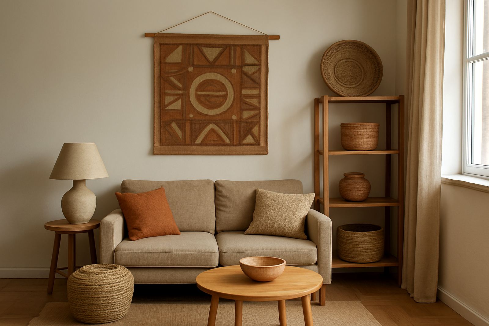
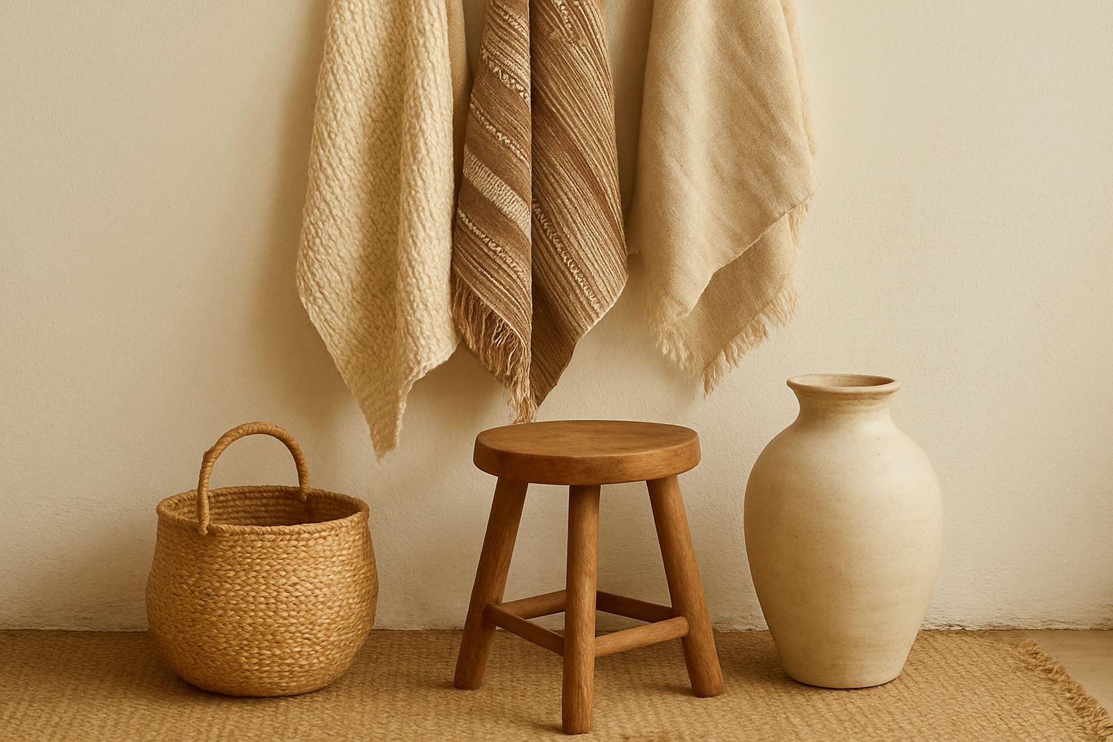
Think of the difference between a plain cotton throw, a woven grass basket, a clay vase and a timber tray. Each one sits in a different way with light. Fibre absorbs softness, clay gives a matte weight, wood brings grain and warmth, and metal adds a small reflective note. Together they make a room feel considered rather than staged.
In South African homes this matters even more because light changes so much through the day. A room in Johannesburg may get hard midday sun, while a Cape Town flat near the coast can feel cool and bright. Texture helps a neutral room hold its shape in both cases.
Start with one anchor material and build around it
Choose one material to lead the room, then layer the others around it. This keeps the space from becoming cluttered and helps you buy with purpose. If the room already has smooth plaster walls and a polished floor, start with something tactile under hand, such as a woven mat, a stitched cushion cover or a hand-thrown ceramic bowl.
- Use fibre first if the room feels echoey or too hard underfoot.
- Use clay first if the room needs a grounded focal point on a table or shelf.
- Use wood first if the furniture is pale and you need natural grain.
- Use metal first if the room lacks light bounce or needs a sharper edge.
The trick is balance. A basket, a stool and a tray can all live in one room, but they should not all compete for attention. Let one piece lead and allow the others to support it. That approach works well for apartments, family homes and hospitality spaces where the room must be calm yet memorable.
Textiles that soften hard edges without fading into the background
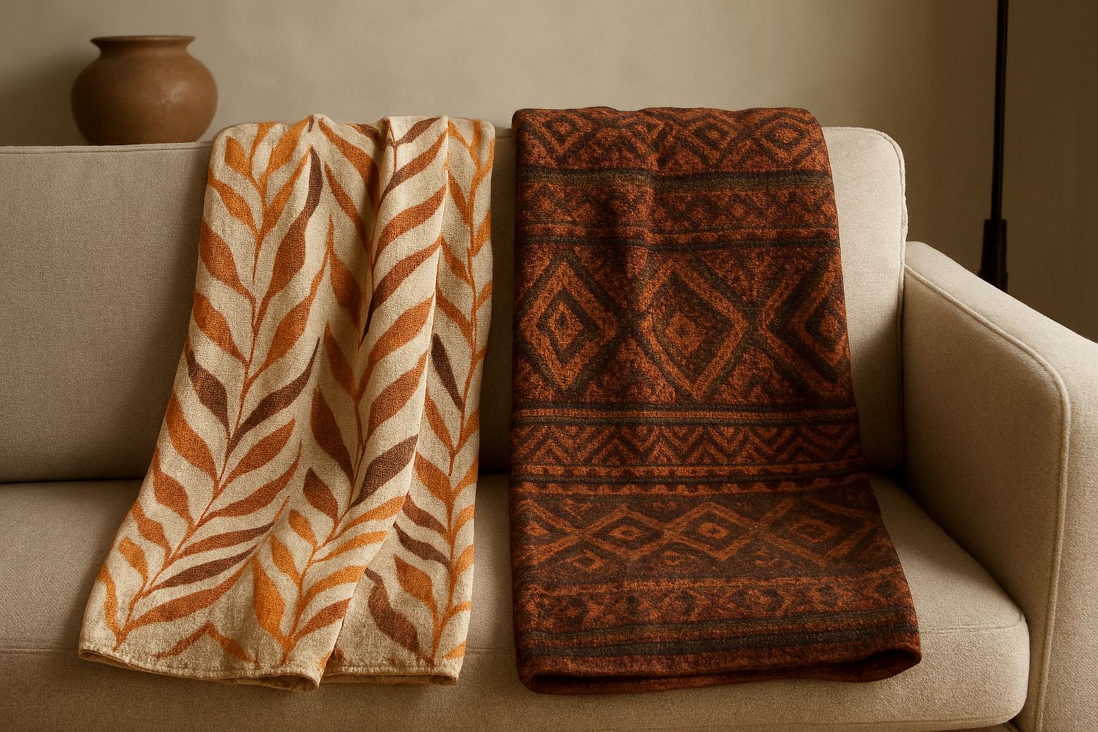
Textiles do a lot of quiet work in neutral rooms. Linen, cotton, handwoven blends and heavier textiles soften corners and make a room feel more usable. They also help regulate how a room feels in different seasons, which is useful in places where summer heat and winter cold can arrive fast.
Use texture in layers rather than in large matching sets. A plain sofa can take a nubby throw, two cushions with visible weave, and a runner on the side table. If the room is already busy, keep the colours close together and vary the surface instead. That way the eye reads interest without noise.
- Mix a smooth fabric with a rougher weave for contrast.
- Keep one textile with a visible stitch or fringe to catch the eye.
- Use a smaller woven piece near a window where daylight can pick up the detail.
- In coastal areas, choose textiles that can be aired often and that do not hold damp smells easily.
For a living room in Midrand, for example, a pale sofa, a natural fibre rug and a couple of textured cushions can stop the room feeling like a showroom. The same idea works in a guest suite in Durban where soft layers matter but the room must still feel neat and practical.
Clay and ceramics bring weight to open shelves
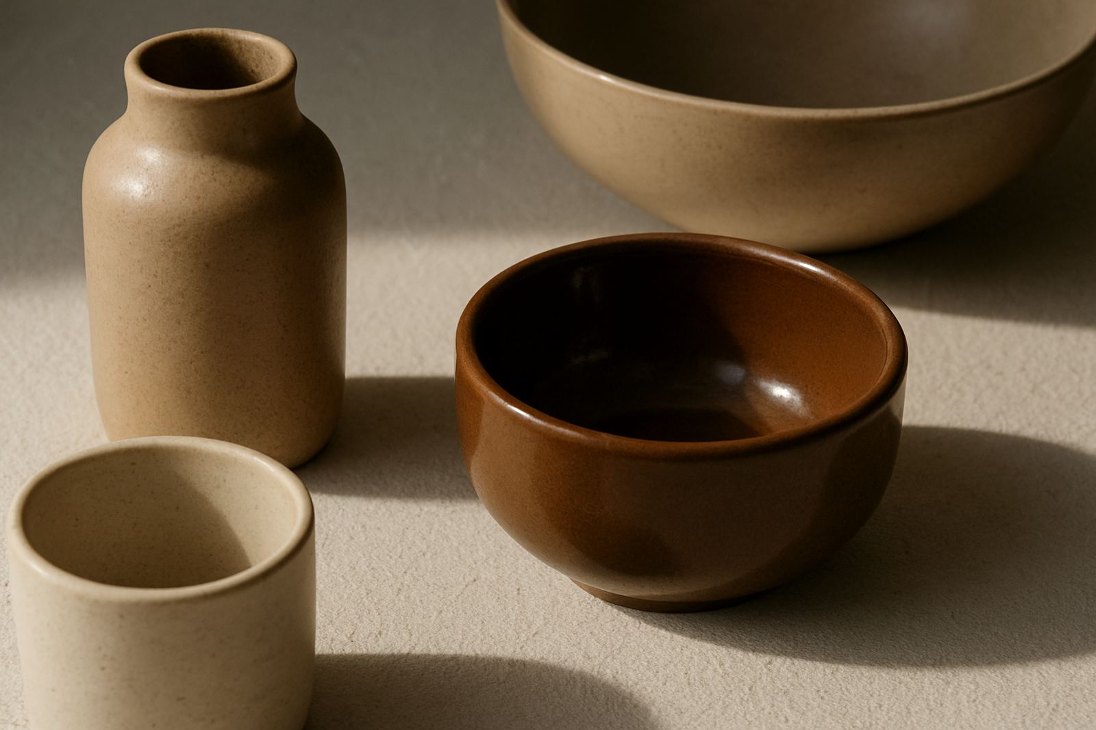
Ceramics are useful in neutral rooms because they add shape without shouting. A good ceramic piece has presence even when the colour is quiet. On open shelving, a matte bowl, a rounded vase or a handled vessel can break up straight lines and make the shelf feel less rigid.
Group ceramic pieces in odd numbers and vary the height. A tall vessel beside a low bowl and a smaller cup creates rhythm. Keep enough breathing room around each piece so the profile can read clearly. If every surface is crowded, the effect is lost.
Clay also works well in rooms where the furniture is mostly straight lined. It introduces softer curves and a hand made finish. In homes where power cuts mean lamps get used often, ceramic shades and vessels can help the room still feel finished when the main lights are off. That softer evening look matters in bedrooms, lounges and boutique reception areas.
In a small Pretoria apartment, for instance, a simple shelf with one ceramic lamp base, a narrow vase and a shallow dish can do more than a shelf full of decorative objects. The room feels calmer and the pieces are easier to clean and move when needed.
Wood grain and metal details keep the room from going flat
Wood adds warmth that paint alone cannot give. Even a small timber tray, a carved stool or a side table with visible grain can stop a neutral room from feeling one note. It is especially useful where walls, upholstery and curtains all sit in pale tones.
Metal should be used with care. A little goes a long way. It works best as an accent rather than the main event, especially in rooms where too much shine would fight with the calm palette. Choose a finish that suits the room temperature. Softer, darker metal reads better with matte surfaces while a lighter finish can lift a room with low natural light.
- Pair wood with fibre for a soft, grounded look.
- Use metal near glass or ceramics to create a sharper contrast.
- Repeat the same wood tone two or three times so it feels intentional.
- Keep metal surfaces easy to wipe down in kitchens, bathrooms and hospitality settings.
In Maboneng, where apartments often mix older building details with newer interiors, this mix works especially well. A timber bench, a woven basket and a slim metal lamp can sit comfortably together without competing with exposed brick or pale walls.
How to style a neutral room for real life in South Africa
Style should suit the way a room is actually used. A home with children, guests, dogs or regular entertaining needs pieces that can be moved, cleaned and packed away. Neutral rooms are easier to live with when the materials are chosen for wear as well as for look.
For hospitality styling, think in layers that can be refreshed seasonally. In summer, use lighter textiles, open weave baskets and cooler clay tones. In winter, bring in denser fabrics and darker wood. For retail wholesale or gifting, provenance cards add useful context and help the buyer understand where the piece came from and how to care for it. That small detail often makes a handmade object feel more personal.
When coordinating delivery across South Africa, practical packing matters too. Ceramics need careful wrapping, textiles should be kept dry, and mixed material sets need to be packed so heavier items do not crush lighter ones. For customers in Cape Town, Durban, Pretoria, Gqeberha and beyond, good packing protects the piece and keeps the presentation intact on arrival.
If you are choosing for a home or project, start with one room and one clear mood. A neutral room does not need many objects, just the right ones in the right finishes. That is often enough to turn a plain room into one with depth, warmth and a sense of care.